Monday, December 31, 2012

Photoshop Confetti Brush

In honor of the last day of the year, I thought I'd celebrate with some custom Photoshop confetti!


Photoshop offers a wide selection of ready-made brushes at your disposal. I'll admit it, a large portion of the time, I rely on the presets for my work. However, it really is super quick and very easy to create your own custom brushes. Most important is becoming familiar with the Brush panel and experimenting with the various settings. There's a ton of options, which can seem intimidating at first, but the more you use them, the less scary they are.

Let's make some confetti! In a new document, hit the B key, or select the brush tool from your tool bar. Select a hard, square brush from the Brush Preset picker. I chose the 16 px square. If the square brushes are not visible to you, click on the triangle in the upper right of the panel, scroll down to Square Brushes and then Append. Next, toggle open the Brush panel. Move the Spacing slider to the right so that there is some space between the squares.


Next, click on Shape Dynamics and crank the Size Jitter up to 100%, the Angle Jitter to 85%, Roundness Jitter to 100% and the Minimum Roundness to about 13%. Under Scattering, increase the Scatter slider to about 1000% and the Count to 2.


At this point we're looking pretty good. The shapes appear at different angles and appear to have some depth.

Next, we can add some texture to simulate a crepe paper surface. Under Texture, choose Driven Snow from the presets, at a Scale of 21% and a Depth of 45%. Set the blend mode to Multiply.


Skip down to Color Dynamics and set both the Foreground/Background Jitter and the Hue Jitter to 100%. Select a bright color for the foreground and background. I picked a cyan and a yellow. Under Transfer, set the Opacity Jitter to 16%.


At this point, I think we've got some pretty realistic-looking confetti.


If you are happy with how your brush looks, click the Create a New Brush icon in the bottom right corner of the palette and give it a name. Now your brush is saved for future use!

For the rest of the image at the top of this post, I created a couple other simple brushes set with wide spacing. A 'doughnut' shape brush made the burst from the bottle and the plain square became my type. Keeping the angle and jitter off here helped keep things legible.

I hope your 2012 was successful, and I wish you a happy, healthy, inspired 2013!

Monday, November 19, 2012

Wedding Invitations:
Jessica & Anant's Simple Elegance

Besides their functional purpose of telling when and where, wedding invitations can really set the tone for the big day and reflect the personalities of the happy couple.


For their fall wedding, Jessica and Anant requested simple elegance, with a splash of saffron as a nod to the groom's Indian heritage. Their save the date postcard featured a saffron-hued illustration of the Brooklyn bridge, the site where Anant asked Jessica to marry him. The text was set in Century Schoolbook, known for its classic simplicity and timelessness. A floral glyph added just the right amount of flourish.


The formal invitations utilized the same font face and floral glyph, with a thin double frame and elegant centered type. Letterpress printing gave a nice tactile feel to the simple design. On the response card, the floral glyph appeared super-sized, with a beautiful punch of saffron that pulled everything together.


In the same vein, the color saffron popped up here and there at the wedding itself. The bride's shoes, belts on the bridesmaid dresses and some of the flowers featured the beautiful hue. The end effect was effortless and unforced. The theme was there, but you weren't hit over the head with it. All the little pieces came together into one beautiful wedding day.

I'm so happy that my invites were able to play a role in Jessica and Anant's big day. I was told that I transformed their heart and soul into the design, and can think of no bigger compliment than that!

Sunday, October 14, 2012

Artist Spotlight: Heather Corey

Creatives grow best by observing, and being inspired by, other creatives. I find it fun to take a peek into how others think and work. In my new Spotlight series, I will share with you some artists and designers I've been digging.

Up first is my good friend Heather Corey of Papermaker's Symphony. Heather wears many hats: artist, papermaker, art teacher and PR Assistant Chair for the hob 'art cooperative gallery in Hoboken, NJ. I'm always inspired by her many talents and am pleased to share her work with you.

Lotus seed pod #1, 2009
Abaca base sheet with paper-based clay
 
EBD: How would you describe yourself: artist, papermaker, teacher? 

HC: My goal is to be an everyday artist who challenges herself creatively. I continue to investigate my artistic motives, the medium in which I work with (abaca fiber), and the complexity of my compositions (i.e. scale, color selection, and the fiber’s arrangement and dimensionality). Furthermore, I continue to investigate paper as the subject, not surface.

As a papermaker, Abaca is my fiber of choice because of its versatility. It is a Philippine banana stem fiber. Beating time softens these fibers, mixing a pulp that casts in low or high relief. Pulp is layered and impressed to explore the fragility of structural forms. I like paper that isn't super-defined. I find beauty in the handmade quality of it.

My teaching career allows me to share my artistic experience and excitement with younger students who are eager to learn and appreciate the fundamentals of art making. Since 2007, I have taught fundamental and advanced drawing, painting, and sculpture courses at the high school level, as well as prepare students for art school with individual portfolio development. The classroom is more or less an art studio environment where students may appreciate and respect how to maintain a working studio while developing their own creativity. Their spark of artistic energy continues to be extremely rewarding for me.
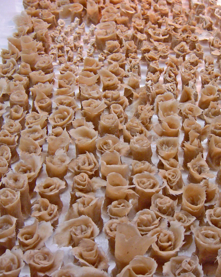
Rose series
Floral vessels in violet, 2010
Pigmented and sculpted abaca from series

EBD: How did you spend your summer off from teaching this year?

HC: On a personal project—I helped my sister plan her wedding, which took place in August. We collaborated on custom invitation design, vintage-inspired centerpiece displays, and wedding favors. Event planning is one of my side hobbies, which allows me to ‘play’ a bit more with my creativity, network, and promote my artwork.

Petal paper, 2010
Dried and laminated roses
Petal Composition #1, 2010
16 x 12 inches
Abaca base sheet with pigmented abaca and
dried roses from series/suite

EBD: What is your latest focus for your art? Any specific projects planned? 

HC: Recently (2011), I was selected to serve as PR Assistant Chair for hob ‘art co-operative gallery in Hoboken, NJ. In this position, I post PR for hob‘art-related exhibitions, fundraiser events, and classes being taught by hob’art gallery members. I recently participated in a three-man exhibition there entitled, ‘REVERIE.' I featured a newer series of my work, entitled 'Love Garment Series,' that is much more personal. I am creating more revealing compositions, which investigate the subject of a corset, allowing the viewer to see variations of femininity, seduction, and human nature.

Heather at work on her Love Garments Series
Drafting process for the Love Garments, each is approximately 4 x 5 feet

EBD: What is your biggest inspiration when it comes to your art?

HC: My favored contemporary artists include: E.V. Day, Richard Tuttle, Lesley Dill, and Mel Kendrick. I had the opportunity to view and assist in the treatment of their works while participating in the Dieu Donné Workspace Program (2007). Since then, their innovative styles continue to inspire me to explore more sophisticated techniques in the hand papermaking process, such as stenciling and hand-cast pulp onto wet and dry sheets.

My current series of work, The Love Garments, combines inspiration from modern movement expressions by fashion designer David Koma and focuses on dramatic coloring and a textural experience that strives to seduce the viewer.

Filling out sketches with hand-cast pulp
Wet studio phase, hand-cast pulp
Love Garments #1, 2012
Hand-cast pulp on canvas

EBD: Tell me a bit about how and where you work.

HC: My studio features a Whiz mixer [to beat pulp] and large Plexiglas worktable. After the beating process, I transfer sheets of poured paper onto the table and begin to tear, roll, and wrap multiple strips of paper into floral and organic forms. When the pieces are finished they are left to dry slowly with a dehumidifier and fan. Pieces generally take 2 weeks to dry. When the paper is completely dry it tends to 'pop' off from the Plexiglas and create a smooth finish. Finally, I assemble these pieces together and secure them onto either canvas or a thick poured sheet of paper.

My studio is located in Suite E510 at the Monroe Center for the Arts in Hoboken, NJ; I welcome visitors anytime.

EBD: How has your work evolved over time?

HC: My work originated as sheets of handmade paper and has evolved into sculpted bouquets, floral vessels, and petal paper, all of which depict particular aspects of nature with their array of assembled textures and structural forms.

My current wall relief series features my trademark sculpted paper roses and emphasizes feminine motion. The fundamental elements of my work are organic and corset forms made from paper fiber and paper clay, layers of paint, India ink and pastel, and are assembled into large-scale works.

Inhabited Space Series I, 2010
Abaca base sheet with sculpted abaca
Dress form bouquet, 2011
Hand-cast abaca pulp, cloth, dried roses
9 x 20 inches | Edition of 3

EBD: You are very involved in the Hoboken arts community. Who are some of your favorite local  artists right now?

HC: I am actively involved with both a mural project and hob’art co-operative gallery in the Hoboken arts community. Artists whom I admire and work alongside include Liz Cohen-painter/sculptor, France Garrido-mixed media/collage, Willie Baez-painter, and Erik Attia-sculptor. 
 
EBD: Where can we find you? What shows are forthcoming? 

HC: The best places to view my art online are my facebook page and my blog. Below are links to these, as well as some other links.

hob’art co-operative gallery: hob-art.org/artists/heather-leigh-corey/
Artslant: artslant.com/global/artists/show/189997-heather-corey
Etsy: etsy.com/shop/PapermakersSymphony
Facebook: facebook.com/heatherleighcorey
Blog: papermakersymphony.blogspot.com

I am participating in an upcoming exhibit, 'Harmony & Contrast: Works on Paper from the East and the West,' at Highwire Gallery, Philadelphia, PA. It runs November 2nd–December 2nd, 2012, and the artist reception is Friday, November 2nd, from 5–9 pm.

I am especially excited about this show because I will be exhibiting with my fellow MFA alumni (Pennsylvania Academy of the Fine Arts), and Professor Michael Moore, PAFA, will be our special guest speaker.


A big thanks to Heather for taking the time to check in with me. I wish her the best of luck in her upcoming show and look forward to seeing more of her work!

Saturday, September 15, 2012

Shoe4Africa

After being in a new-baby haze for the past month-and-a-half, I'm recharged and ready to get back into the swing of things. Baby boy has kept me busy, and has given me the opportunity to miss and appreciate my work.

Back before my mommy days, I lived in New York City and was part of the awesome running community there. My coach, Toby Tanser, also happened to be the founder of Shoe4Africa, a non-profit that empowers through sports and education, creates unique health initiatives, and promotes AIDS awareness in East Africa.

Besides running on the S4A running team to help promote the non-profit, I've also had the pleasure of working with Toby on design projects. Toby's largest undertaking thus far is the hospital project. He is in the process of building East Africa's first public children's hospital. In November of 2010, Toby embarked on a 250-mile run from Mombasa to the top of Mount Kilimanjaro to raise money and awareness for this project.

Toby came to me, requesting a poster image to use at a fundraiser event. Reading about his planned route, I was inspired to create an illustration depicting his journey. I chose a hopeful, peaceful and thought-provoking color palette. I employed texture and expressive line work to convey the rough nature of the feat, and used a combination of font faces and colors to give the type a nice contrast and cool vibe.


The fundraising helped give the hospital project a boost and Toby completed his amazing journey, which you can read about here

Shoe4Africa is still in need of funds, and here is my appeal to you for an easy way to help. Currently in competition for a Ranger pickup truck to help build the hospital, all that is needed is your vote. Please visit www.facebook.com/KjaerKjaer?sk=app_455188447836364 and vote for the Shoe4Africa project (Look for the image of the hospital building). Thank you so much for your support! 

Tuesday, June 12, 2012

Sketching Architecture

Yikes! Somehow two months have passed since my last blog post. Where has the time gone?

I've been quite busy with design projects, home projects and a growing bun in the oven. I plan to feature some of my latest work in future posts, as well as begin an interview series highlighting inspiring artists and illustrators. Lots to look forward to!

But for now, I take us back through my sketchbook. Many times—to me at least—a sketch can be more exciting and interesting than a final piece of art. I've always favored sketching the human figure and portraits, and my many sketchbooks are filled with them. More recently, however, I've found myself drawing buildings and interior spaces, something that always seemed too tedious to me. I love the character and life that quick strokes and exaggerated colors have given to these structures. They might not be as precise or as planned as my architect husband's sketches, but they make me happy.


The image of the staircase was done during my first maternity leave, and the others during vacations. Sometimes that's the only extra time I get to just draw! Here's hoping my upcoming maternity leave is full of sketching as well.

How do you make time to do your favorite things?

Friday, April 6, 2012

Baby New Year Illustration

Last year, my cousin was pregnant and she wound up with a due date of January 1st—a new year baby! While brainstorming for her shower invitation, I kept coming back to the due date. That was something special! I decided to create a soft and sweet illustration of baby new year in sash and top hat.

I wanted to experiment with mixing patterns for this illustration. In my research, I stumbled up this lovely (and free!) floral Photoshop pattern at Pixels & IceCream, and used it as my jumping off point for look and feel of the piece.

Gypsy Garden by Pixels & IceCream

In Photoshop, I illustrated the baby, hat and sash using my tablet. I added the floral pattern to the sash around the hat, and another texture to the main sash itself. I also hand-lettered the text on the front of the invite. Using the pen tool, I created the border shape, and filled that with a single-tone version of the Gypsy Garden pattern.


Since our Baby New Year was to be a little girl, I carried over the sweet pink from the hat onto the back as a highlight color. (Please note I've changed the the text in the version below so as not to give out last names and personal contact info.)


Not long after the invites were sent out, my cousin's baby decided to make an extra early arrival and turned out to be a Turkey Day baby instead! What a fun invite that would have been to design! The little love is doing great and just wanted to keep us all on our toes.

Thursday, February 23, 2012

Summer on the Brain

My two-year-old has been asking me recently if we can go to the beach. I've got family vacation photos scattered throughout the house, many at the beach. No matter how many times I explain that it's too cold, she insists she wants to go now! All the beach talk has really made me want to pack my bathing suit and hop a plane to a warm, sunny destination.

Since that's not in the cards, I thought I'd pull out some sketchbook pages from vacations past.

Morning palm trees in Cocoa Beach

View from our Cocoa balcony

Wavelets capped by billowy clouds

If you're lucky enough to be vacationing soon, enjoy! If you're still got awhile like me, I hope these tide you over til summer!

Friday, February 3, 2012

Method of the Year Cover Illustration

Cover image used with permission from Nature Methods.
The January issue of Nature Methods research journal featured one of my favorite recent projects: illustrating the Method of the year for 2011. I created the "template" for the Method of the Year image several years ago, which included a globe made of Nature Methods cover images and a depiction of the Method of the Year. Each year I've updated the covers so that the most recent are featured front and center, and changed the method imagery to match. Some years, the background has included another component that pertains to the method.

For 2011, the editors selected Genome Editing with Engineered Endonucleases as their Method of the Year. In layman's terms, using this particular technology, scientists are able to make very precise, targeted changes in the genome. A pair of scissors/dart represented this precise editing. 

So how did I make it? 

In Photoshop of course! First I created the globe shape using a Shape Layer. Then I used the Vanishing Point tool to set up a rough perspective grid around the globe. I used layer masks to refine the shape of each cover image and make them appear rounded. I worked the globe concurrently with a sketch of the foreground, to make sure the highest area of contrast was near the target and that the scissors would appear over a darker image. 


After the globe was complete, I pasted a merged copy of it into a new document. To create the dartboard, I used shape layers to make a flat target. I slightly shifted them off-center to the right, since I knew I wanted that side to go back into space. 


I converted all the dartboard shape layers into a Smart Object and did a Perspective Transform, so it looked more like an oval going back into space. I then added a Bevel and Emboss, Drop Shadow, Texture and Gradient Overlay to it to give it depth and interest. On separate layers, I added more shading and highlights, as well as the strand of DNA.  The wooden stand was made in a similar manner, starting with shape layers, then adding texture and overlays. 

For the scissors, I again started with a few simple shapes, created a Smart Object and made the pieces come to life with Drop Shadow and Bevel and Emboss. It always amazes me how you can start so simple and build until you wind up with something complex and interesting. 


Back in the main window, I worked on creating a sense of motion for the scissors. I duplicated them a few times and added varying degrees of Motion Blur and Opacity.

In the background, I added a DNA sequence that appeared in the very first Method of the Year cover, darkening it so that the motion blur would stand out. After some final shading to the globe and a soft overall vignette, I was finished!

It was a lot of intricate, detailed work, but I'm really pleased with how it turned out. Looking forward to working on MOTY 2012!


Cover image used with permission from Nature Methods.